I think this is one of my
favorite Sale-a-bration (SAB) samples I've made this year. I love the
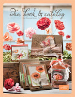
cheery colors, the simple layout and the bling! The colors were inspired by samples in the
idea book and catalog. The catalog is a great place to go for inspiration for color, layout and techniques. Need a catalog? Email me today at the address above.
This 6-piece SAB exclusive stamp set, Sprinkled Expressions, features a star, a
heart and this flower with matching phrases and is found on pg. 8 of the
SAB catalog.
Good design usually includes odd numbers of images and varying sizes which are more pleasing to the eye. In the sample I showed you with the
heart, I overlapped the saying with the heart to create the main element and paired that with the randomly stamped small hearts on the background strip.
In this sample, I used the flower in a repeating pattern highlighting the lovely colors, Concord Grape, Melon Mambo and Certainly Celery, and allowed the phrase to become the central image.
The punched shape and the bling allow the phrase to stand out on this card. You can see the
bling a little better in this close up. The small rhinestones were added to the sweet, little flowers above the phrase, and medium rhinestones were added to a few of the flowers on the background page. Of course, rhinestones are always better in real life!
Card recipe:
Stamps: SAB Sprinkled Expressions, clear mount #125132 or wood mount #125130
Don't forget to send a message or leave a comment if you need a catalog!
Enjoy!
Julie